Camp John Hay, Baguio City—Unveiled on the 100th day in office of JHMC President and CEO Manjit T. Singh Reandi, the new John Hay Management Corporation (JHMC) logo is a bold yet humble symbol of stewardship, sustainability, and service. Designed entirely in-house by ICT Specialist Mark Jason Adviento, the logo embodies JHMC’s core values—and was created at zero cost to the government.
DESIGNED WITH PURPOSE, MEANING IN EVERY ELEMENT
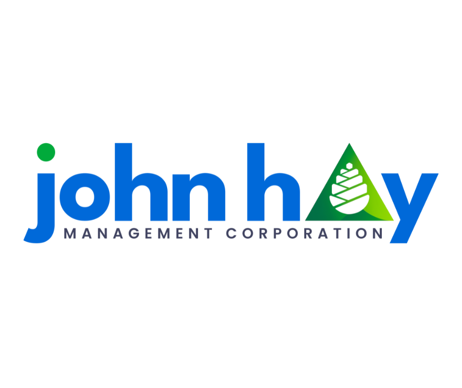
The use of lowercase letters signals approachability, trust, humility, equality, inclusion, and ease of engagement—echoing the principles of Republic Act 11032 on ease of doing business.
A single dot symbolizes nature and environmental responsibility, grounding the logo in JHMC’s commitment to sustainability.
The letter “A” in “John Hay” stands for Action, Alignment, and Accountability:
Action reflects results.
Alignment highlights synergy with BCDA and stakeholders.
Accountability ensures every decision upholds JHMC’s core values.
The triangle represents strength, stability, and forward movement—anchored in JHMC’s three pillars: sustainable estate management, inclusive development, and environmental stewardship. These principles shape the corporation’s identity and guide every decision it makes.
As the new logo graces official platforms and public spaces, it invites everyone to see Camp John Hay not just as a destination, but as a living legacy of responsible governance—toward a sustainable, inclusive, strategically developed Camp John Hay.